

The Journey to a Better Development Workflow
As a web developer constantly starting new projects, I’ve always felt the need for a personal foundation that aligns with my workflow and design sensibilities. This led me to create my React Chakra UI Starter Template – a thoughtfully crafted launchpad for my future web applications that balances aesthetics, functionality, and developer experience.
Why I Created This Template
Every developer knows the drill: starting a new project means repetitive setup, reinstalling the same packages, recreating folder structures, and reimplementing common components. It’s time-consuming and, honestly, not the most exciting part of development.
My goal with this starter template was to solve several problems at once:
- Speed up project initialization – Having a ready-to-go foundation means I can jump straight into building unique features
- Maintain consistency across projects – Using the same base ensures my projects share UI patterns and code architecture
- Incorporate modern best practices – Building on React 18 with a thoughtful component structure and organization
- Provide a beautiful UI out of the box – Leveraging Chakra UI’s design system while adding my own customizations
Embracing Design Systems with Chakra UI
One of the most important decisions I made was to build on Chakra UI. This wasn’t just about using a component library – it was about embracing a complete design system approach.
Why Chakra UI?
After evaluating several UI libraries, Chakra emerged as the clear winner for my workflow:
- Component-driven development – Chakra’s atomic component approach aligns perfectly with React’s philosophy
- Accessibility first – Having accessibility baked in rather than bolted on later is invaluable
- Theming flexibility – The ability to create and extend themes gives me both consistency and creative freedom
- Dark/light mode support – Built-in color mode switching saves significant development time
Component Architecture
The starter isn’t just about styling – it’s about architecture. I’ve structured the components to balance reusability and specificity:
Layout Components
I built a comprehensive layout system that handles everything from page structure to spacing consistency:
- PageLayout – The main wrapper that includes navigation and footer
- Section – For dividing content into meaningful blocks with consistent spacing
- Container variants – Different container widths for various content needs
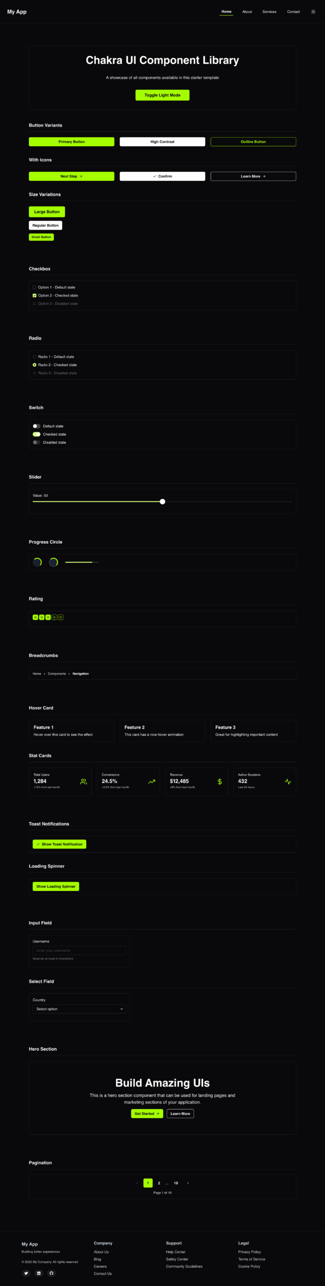
UI Component Categories
I organized UI components into intuitive categories:
- Navigation – Breadcrumbs, pagination, and navigation bars
- Data Display – Cards, stat displays, and information presentation
- Feedback – Loading indicators, toast notifications, and status messages
- Forms – Input fields, select controls, and form validation
- Marketing – Hero sections and call-to-action components
This categorization makes it easy to find the right component for each need while encouraging consistency across interfaces.
Developer Experience Enhancements
Beyond the user interface, I focused heavily on developer experience:
- Organized folder structure – Intuitive organization of components, pages, and utilities
- React Router integration – Ready-to-use routing with sensible defaults
- Error boundary – Built-in error handling to prevent complete application crashes
- Helmet integration – For managing document head and SEO optimization
I also included a comprehensive set of scripts and documentation to make onboarding seamless for future projects or team members.
Responsive Design Philosophy
Responsive design isn’t an afterthought in this template – it’s fundamental to its architecture. I implemented:
- Mobile-first approach – Building for small screens first then enhancing for larger ones
- Fluid typography – Text that scales elegantly across device sizes
- Responsive layout utilities – Chakra’s responsive array syntax for breakpoint-specific styling
- Adaptive navigation – Navigation that transforms gracefully from mobile to desktop
This example from the hero section demonstrates the responsive approach:
jsx<Stack
  direction={{ base: 'column', sm: 'row' }}
  spacing={4}
  width={{ base: '100%', sm: 'auto' }}
>
  <Button colorScheme="lime" width={{ base: '100%', sm: 'auto' }}>
    Primary Action
  </Button>
  <Button
    variant="outline"
    colorScheme="lime"
    width={{ base: '100%', sm: 'auto' }}
  >
    Secondary Action
  </Button>
</Stack>
Future Roadmap
This starter template isn’t a finished product – it’s a living foundation that will evolve alongside my development practices. I plan to:
- Expand component library – Add more specialized components as I build them for projects
- Implement testing patterns – Add Jest and Testing Library with example tests
- Add animation system – Integrate Framer Motion for consistent animation patterns
- Create project generators – Build scripts to scaffold new page types and components
- Integrate state management – Add optional Redux toolkit or React Query integration
Lessons Learned
Building this starter taught me valuable lessons about my own development process:
- The value of design systems – Having a cohesive design language speeds up decision-making
- Component granularity – Finding the right balance between atomic and composite components
- Theming depth – How deeply to customize vs. when to leverage defaults
- Architecture evolution – Building systems that can evolve without complete rewrites
Conclusion
Creating my own starter template has already paid dividends in productivity and consistency. It embodies my development philosophy and design aesthetic while providing a solid foundation for future work.
If you’re a developer considering whether to build your own starter, I highly recommend it. The upfront investment yields ongoing returns in efficiency, consistency, and the joy of starting new projects with your ideal foundation already in place.
This React Chakra UI Starter Template is available on GitHub. Feel free to fork it, learn from it, or use it as inspiration for your own starter template.